
Density Based Novelty Detection
Introduction and terminology
Novelty detection is a term describing different machine learning processes that try to teach a program to distinguish unusual or irregular measurements from regular data. These outliers are suspected to originate from different mechanisms than the usual data (in contrast to statistical noise that occurs due to environmental effects or measurement errors).
Novelty detection differs from other classifiers in regard to the data that is to be analyzed: Classifiers such as the support vector machine try to separate rather balanced datasets. The number of examples for each class has to be sufficiently high. When there is a minority class, of which there is only a handful of data points, novelty detection algorithms tend to produce better results. The decision process regarding the correct application could be modeled as follows:
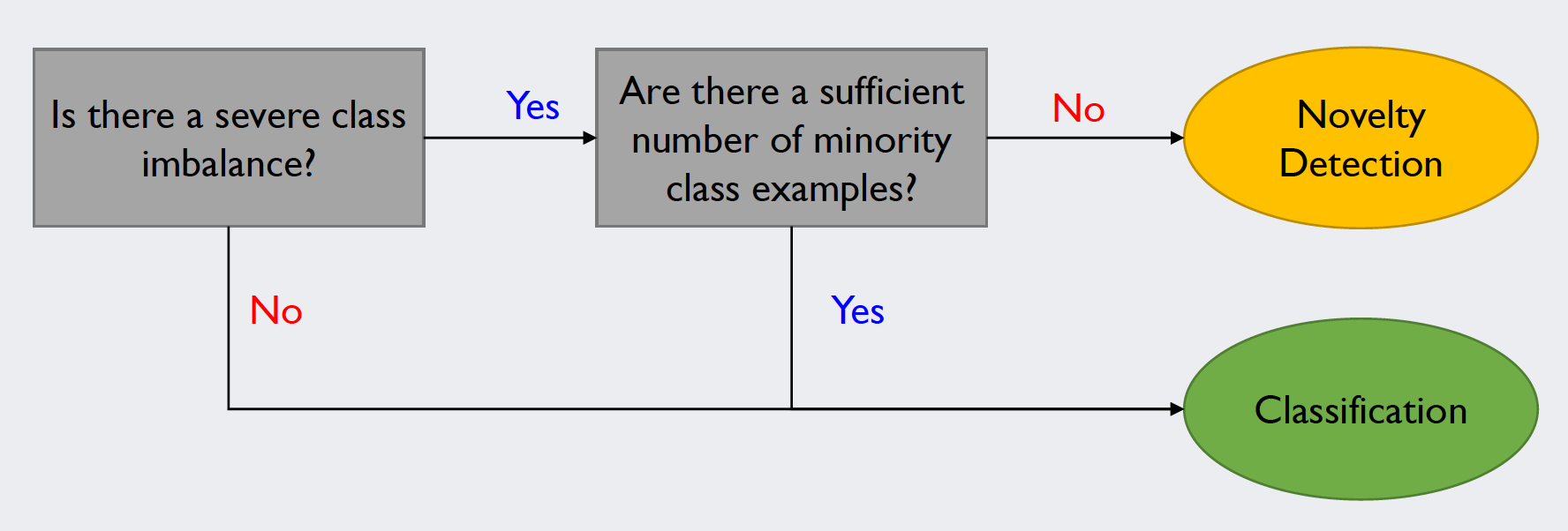
Source: Kang, Pilsung: “Novelty Detection.” Business Analytics. Korea University, Fall 2018. Lecture.
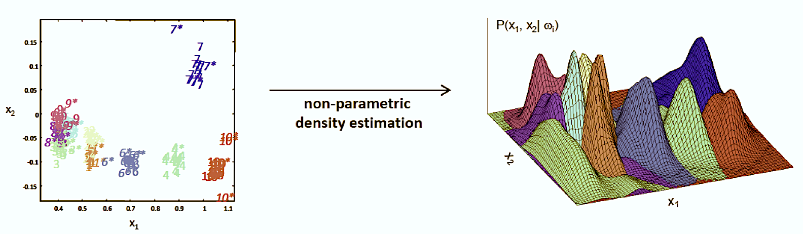
This post focuses on a certain field of novelty detection algorithms, namely the density-based approach. Generally speaking, these algorithms search for outliers by looking for distribution patterns in the data points and subsequently labeling the data points that do not fit the pattern as outliers.
Gaussian Density Estimation (Unigaussian Method)
The first of the code examples covers the most basic approach of density-based novelty detection. In the most simple form of density estimation, we assume that the data is distributed over a single Gaussian function. Based on this assumption, we can calculate the maximum likelihood estimators for the mean and the standard deviation of the training dataset. In a further assumption, we define every test sample that has low value according to the density function to be an outlier.
The imports
First, the modules required for our program are imported. In this case, we use pyplot, pandas and seaborn for plotting purposes, numpy for our linear algebra calculations and and the stats module from scipy to facilitate handling our stochastic functions. The code is written in Python 3 and should run in any updated, solved environment with some additional scientific Python libraries installed. Additionally, when using Jupyter, matplotlib should be configured to the “notebook” layout. Sometimes, 3D plots appear very small in Jupyter, so we fix the graph size in the last line.
# For plotting
import matplotlib.pyplot as plt
import pandas as pd
import seaborn as sns
# For matrix math
import numpy as np
# For normalization + probability density function computation
from scipy import stats
# Plot style
%matplotlib notebook
# Set plot size in notebook
plt.rcParams["figure.figsize"] = (5, 5)
The dataset
The dataset used is simply referred to as “Glass” in most applications. It can be downloaded from the UCI machine learning repository. The set contains 214 instances, each point having 9 dimensions plus a class label. It is frequently used for novelty detection, as class 6 represents a minority class. All files used in this post can be found in my GitHub repository.
# Import a Dataset used for Novelty Detection
# Change the file path to your directory!
glass = pd.read_csv("../2.Data/Glass_Data.csv")
glass.head(n=5)
Source: B. German, Home Office Forensic Science Service Aldermaston (1987-09-01). UCI Machine Learning Repository [http://archive.ics.uci.edu/ml]. Irvine, CA: University of California, School of Information and Computer Science.
Visualizing the data
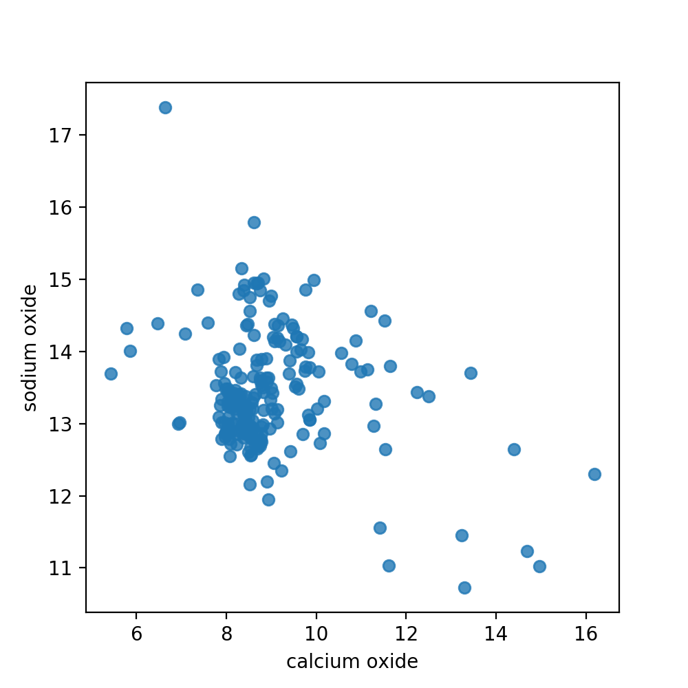
For practicality reasons we will only use two dimensions of our instances for the remainder of this chapter. This will allow us to visualize our data points as well as the density function that we calculate. Here, we use the regplot function of seaborn to plot our points, with values from column 2 and 7 (arbitrarily chosen). As we do not need a regression, we switch off this functionality with the parameter fit_reg.
# Plot 2 Dimensions of it (Scatter)
dim1 = 'calcium oxide'
dim2 = 'sodium oxide'

sns.regplot(x=dim1,y=dim2,data=glass,fit_reg=False)
plt.show()
Separating the data
Before we get down to the actual training of the density function we need to remind ourselves again that novelty detection is similar to other classification methods, but not the same. Novelty detectors are only trained on target samples. That is, we have a “clean” training dataset without pollution from novelty data. Only when it comes to testing we want to distinguish outliers from our relevant data:
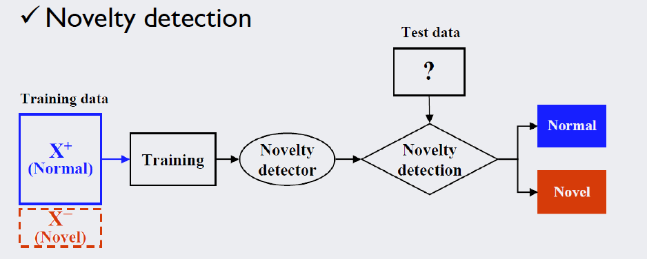
Source: Kang, Pilsung: “Novelty Detection.” Business Analytics. Korea University, Fall 2018. Lecture.
Following this logic, we want to separate our dataset into variables and labels, as well as create a clean subset for training, and a polluted (smaller) subset for testing. This was done simply by using slicing with Python indices and functions provided by numpy. The indices look a bit arbitrary; that is just due to the fact that our novelty data (class 6) is wedged into the clean data. What we actually did will be clear by the output.
# Estimate the mean and covariance with clean training data

# Take only these 2 Dimensions
dataset = glass[[dim1,dim2]].values
labels = glass[['type']].values

# Separate training data (clean)
X_train = np.append(dataset[9:176],dataset[185:], axis=0)
Y_train = np.append(labels[9:176],labels[185:])

# Test data (polluted)
X_test = np.append(dataset[:9],dataset[176:185], axis=0)
Y_test = np.append(labels[:9],labels[176:185])

# Print the labels to verify correct slicing
print("Dimension Training Data: ", X_train.shape)
print(Y_train)
print("Dimension Test Data: ", X_test.shape)
print(Y_test)
Looking at the output, we see that we created a clean training dataset, spanning 196 samples without any pollution from class 6. The test data spans 18 instances, having equal parts of target (class 1) and novelty data (class 6). This will enable us to check how the algorithm performs. (There is no label for class “4” in the dataset as this subset was removed by the original authors. To our cause, this does not matter).
Dimension Training Data:  (196, 2)
[1 1 1 1 1 1 1 1 1 1 1 1 1 1 1 1 1 1 1 1 1 1 1 1 1 1 1 1 1 1 1 1 1 1 1 1 1
 1 1 1 1 1 1 1 1 1 1 1 1 1 1 1 1 1 1 1 1 1 1 1 1 2 2 2 2 2 2 2 2 2 2 2 2 2
 2 2 2 2 2 2 2 2 2 2 2 2 2 2 2 2 2 2 2 2 2 2 2 2 2 2 2 2 2 2 2 2 2 2 2 2 2
 2 2 2 2 2 2 2 2 2 2 2 2 2 2 2 2 2 2 2 2 2 2 2 2 2 2 3 3 3 3 3 3 3 3 3 3 3
 3 3 3 3 3 3 5 5 5 5 5 5 5 5 5 5 5 5 5 7 7 7 7 7 7 7 7 7 7 7 7 7 7 7 7 7 7
 7 7 7 7 7 7 7 7 7 7 7]
Dimension Test Data:  (18, 2)
[1 1 1 1 1 1 1 1 1 6 6 6 6 6 6 6 6 6]
Estimating the density function parameters
The numpy library supplies great tools for calculating mean vectors and covariance matrices:
# Calculate trained density function parameters and print them
meanVector = np.mean(X_train,axis=0)
covMatrix = np.cov(X_train.T)
print(meanVector)
print(covMatrix)
[ 8.9752551  13.35020408]
[[ 2.0856466  -0.3294221 ]
 [-0.3294221   0.59976509]]
Plotting our multivariate normal distribution
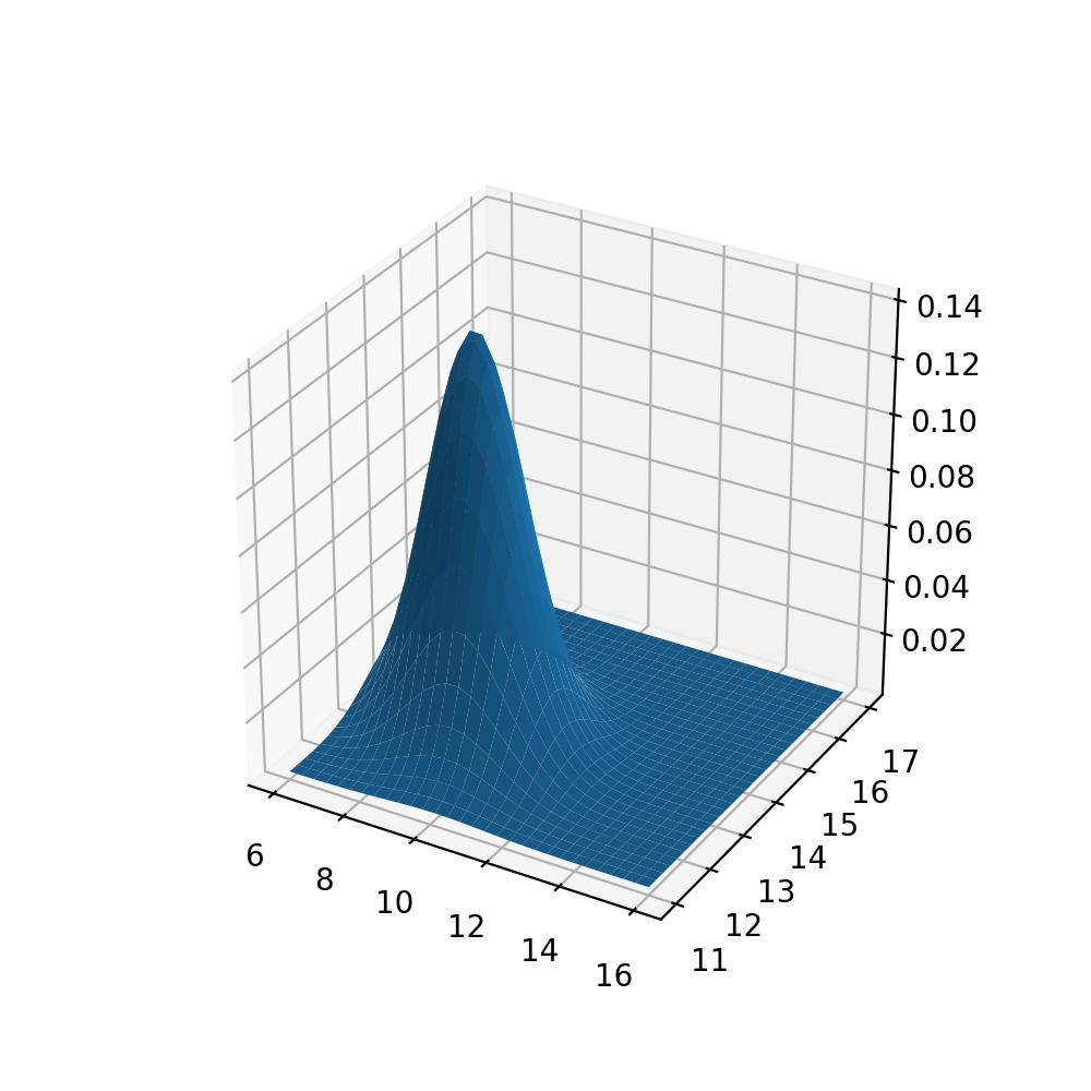
Using the 3D tools of matplotlib and the multivariate_normal statistics tool, we can visualize our multidimensional density function. We fill the increments of the axes with np.mgrid and ensure correct representation by carefully adjusting the intervals.
The .pdf() function will calculate our density values. Depending on preference, the line ax.plot_wireframe(xaxis,yaxis,z) can be uncommented along with removing the surface of the plot.
# Import 3D-Tools
from mpl_toolkits.mplot3d import Axes3D
from scipy.stats import multivariate_normal

# Correct Grid
xaxis, yaxis = np.mgrid[6:16:30j, 11.0:17.0:30j]
xy = np.column_stack([xaxis.flat, yaxis.flat])

# Use the mean and covariance
z = multivariate_normal.pdf(xy, mean=meanVector, cov=covMatrix)

# Argument must be 2-Dimensional
z = z.reshape(xaxis.shape)

# Plot!
fig = plt.figure()
ax = fig.add_subplot(111, projection='3d')
ax.plot_surface(xaxis,yaxis,z)
#ax.plot_wireframe(xaxis,yaxis,z)
plt.show()
The base plane grid has the same intervals and minimum/maximum values as the scatter plot of our data above in order to be comparable. Qualitatively speaking, we see that the peak of out density function is in the lower left part of the plane, as is the largest concentration of data points in the scatter plot (see above).
Identifying the outliers
We now want to use the density function to identify outliers in the data. Like stated above, we can use the probability density value as a measure: If the new data point lies out of bounds of a predefined density region, we mark it as “outlier”. The image below illustrates the cutoff process for a density value of 0.1:
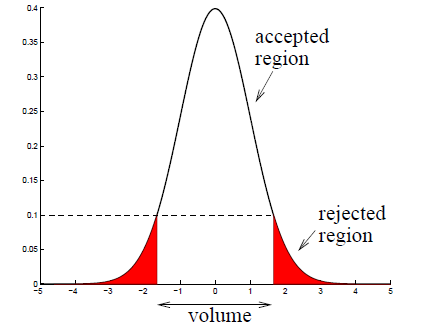
Source: Kang, Pilsung: “Novelty Detection.” Business Analytics. Korea University, Fall 2018. Lecture.
For every data point we will compare the pdfvalue to a predefined cutoff value. In this example, the cutoff value is 0.09 which, after empirical testing, was found to be performing the best.
cutoff = 0.09

for i in range(X_test.shape[0]):
    pdfvalue = multivariate_normal.pdf(X_test[i],
                                       mean=meanVector,
                                       cov=covMatrix)
    if pdfvalue < cutoff:
        print(X_train[i],pdfvalue,"outlier")
    else:
        print(X_train[i],pdfvalue,"normal")
This code produces the following console output:
[ 8.4 13. ] 0.13867917463915624 normal
[ 8.09 12.72] 0.09666939826548396 normal
[ 8.56 12.8 ] 0.10571595836166811 normal
[ 8.05 12.88] 0.12213243328996855 normal
[ 8.38 12.86] 0.11690852352635347 normal
[ 8.5  12.61] 0.07790449705520644 outlier
[ 8.39 12.81] 0.12385904697808973 normal
[ 8.7  12.68] 0.11938745305827869 normal
[ 9.15 14.36] 0.09786525909218284 normal
[ 8.89 13.9 ] 0.08256510024167225 outlier
[ 8.44 13.02] 0.09559896044662591 normal
[ 8.52 12.82] 0.04323283133675518 outlier
[ 9.   14.77] 0.08136750135366524 outlier
[ 8.7  12.78] 0.050044405014654236 outlier
[ 8.59 12.81] 0.006286425445192427 outlier
[ 8.43 13.38] 0.020649840705631386 outlier
[ 8.53 12.98] 0.004765566096838831 outlier
[ 8.43 13.21] 1.958860761613039e-07 outlier
Because we separated the test data conveniently, we already see at first glance that our algorithm did not perform too bad: The first half is target data and produced the output “normal” quite frequently, in the second half we see a lot of samples marked as “outlier”. How can we quantify our performance?
Assessing the results
In novelty detection we can have four cases of identification result:
- We correctly label a target sample as normal. This is called a true positive.
- We wrongfully label a novelty instance as normal. This is called a false positive.
- We correctly label a novelty instance as novelty. This is called a true negative.
- We wrongfully label a target sample as novelty. This is called a false negative.
These four values are often summarized in the confusion matrix. In it, we want our correct assessments (on the main diagonal) to be as large as possible, with the other entries being as low as possible. The code below will yield exactly that. Note: By using X_test.shape[0]/2 in our if-conditions, we exploit the fact that the test data is exactly split in half regarding the pollution.
# Generate confusion matrix:
tp = 0
fn = 0
tn = 0
fp = 0
results = np.empty((X_test.shape[0],1),dtype='object')

for i in range(X_test.shape[0]):
    pdfvalue = multivariate_normal.pdf(X_test[i], mean=meanVector, cov=covMatrix)

    if i < X_test.shape[0]/2 and pdfvalue >= cutoff:
        tp = tp + 1
        results[i] = "True Positive"
    if i < X_test.shape[0]/2 and pdfvalue < cutoff:
        fn = fn + 1
        results[i] = "False Negative"
    if i >= X_test.shape[0]/2 and pdfvalue < cutoff:
        tn = tn + 1
        results[i] = "True Negative"
    if i >= X_test.shape[0]/2 and pdfvalue >= cutoff:
        fp = fp + 1
        results[i] = "False Positive"

print("Confusion Matrix:\n",tp,fp,"\n",fn,tn)
Our output looks as follows:
Confusion Matrix:
 8 1
 1 8
With this, we could calculate a multitude of performance measures (every one of those can be looked up and is not necessarily part of our topic). We will just compute the F1-Score, which is a common performance indicator between 1 (perfect) and 0 (bad).
# F1 Score
f1 = (2*tp)/(2*tp+fp+fn)
print(f1)
For this example and cutoff value, the F1-Score is about 0.89, which is mediocre compared to other algorithms.
Visualizing our results
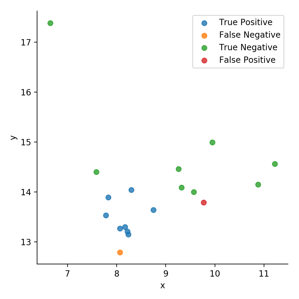
Creating a new data frame, we can use seaborn once again to visualize our data. This time, we use the hue parameter to differentiate the confusion matrix values of the test data by color. To label the data with the confusion matrix values, we crated an ndarray called results before and filled it with entries of the data type str.
# Plot the result
points = pd.DataFrame(X_test,columns=['x','y'])
values = pd.DataFrame(results,columns=['values'])
plot = points.join(values)
plot.head()
sns.lmplot(x='x', y='y', data=plot, fit_reg=False, hue='values', legend=False,)
plt.legend(loc='upper right')
plt.show()
The overall mediocre results of our approach are due to one main reason: This method makes a lot of assumptions, namely the density being an unimodal and convex distribution. In the light of this assumption, it is clear that the algorithm will not handle datasets with multiple clusters (like ours) all too well. To improve on this result, we will have to look at more sophisticated methods.
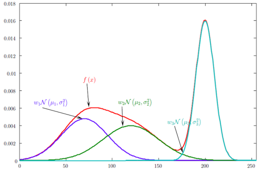
Mixture of Gaussian Density Estimation (MoG)
The aforementioned assumptions (unimodal and convex distribution) are often too strong and do not hold up in the case of data points based on multiple underlying mechanisms. The MoG novelty detection is a way to remedy these strong assumptions: We allow a multi-modal distribution by estimating a linear combination of Gaussian density functions. This approach comes with its own set of challenges, such as the question “How many functions should we combine” (which is essentially choosing a hyperparameter) and finding the correct defining features of our density functions.
Source: Kang, Pilsung: “Novelty Detection.” Business Analytics. Korea University, Fall 2018. Lecture.
The imports
The modules we use are mainly the same, with the most relevant exception being the KMeans class from sklearn.cluster. Its use will be explained in due time.
# Imports
import matplotlib.pyplot as plt
import pandas as pd
import seaborn as sns
# For matrix math
import numpy as np
# For normalization + probability density function computation
from scipy import stats
from scipy.stats import multivariate_normal
# For pre-clustering
from sklearn.cluster import KMeans
# Plot style
%matplotlib notebook
# Set plot size in notebook
plt.rcParams["figure.figsize"] = (5, 5)
The dataset
We will use the same dataset as before in the single mode Gaussian approach. However, this time we will use 3 input dimensions, as the focus will lie on performance of the algorithm rather than visual understanding. However, the separation of the instances into test and training data remains the same, with a 196-instance training set and an 18-instance test set:
# Values of dataframe
npdata = glass.values
# Separate input data from labels
# 3 Dimensions of input
npinput = npdata[:,1:4]
nplabels = np.delete(npdata,np.s_[:9],1)

# Separate training data (clean)
X_train = np.append(npinput[9:176],npinput[185:], axis=0)
Y_train = np.append(nplabels[9:176],nplabels[185:])
# Rest: Test data (polluted)
X_test = np.append(npinput[:9],npinput[176:185], axis=0)
Y_test = np.append(nplabels[:9],nplabels[176:185])
print(X_train.shape)
print(X_test.shape)
(196, 3)
(18, 3)
Scaling the data
In order to increase performance of this method it can be sensible to scale the dataset. Furthermore, this will help with numerical stability in our process. Luckily, sklearn.preprocessing has a class that can effortlessly take on this task without much coding from our side.
# Scale the dataset
from sklearn.preprocessing import StandardScaler
scaler = StandardScaler()
scaler.fit(X_train)
X_train = scaler.transform(X_train)
X_test = scaler.transform(X_test)
Defining the parameters
For conveniences sake, we define some variables beforehand. The most interesting one here is classes, which ultimately defines how many density functions we combine in the end to estimate our distribution. It can be viewed as hyperparameter, as it has a large effect on the performance and is chosen based on the dataset and experience. In our case, we set it to 5, which is the numbers of clusters we expect from the target samples.
# Define Hyperparameter: Number of PDFs to combine / clusters
classes = 5
# Number of Dimensions:
dimensions = X_train.shape[1]
# Number of (training) instances:
instances = X_train.shape[0]
# Number of test instances:
test_instances = X_test.shape[0]
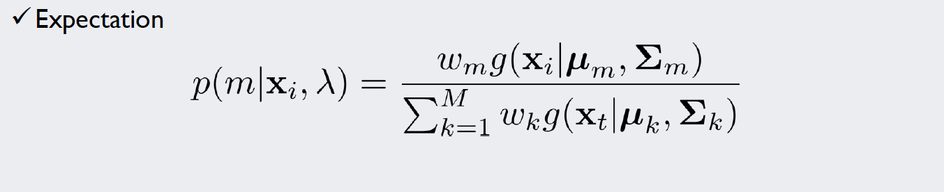
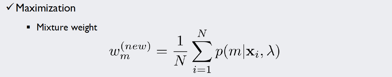
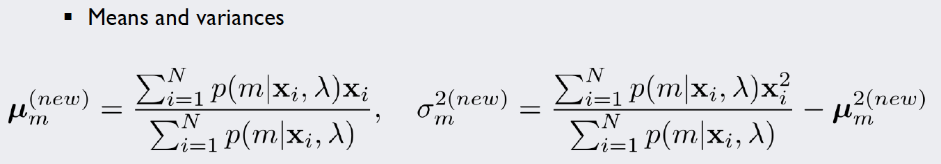
The Expectation-Maximization Algorithm
By introducing multiple density functions we will gain the ability to analyze more complex data. However, we also introduced a challenge: there is no information about the assignment of our instances to the respective density functions in our dataset. That is, we do not know which data points to consider when estimating a certain density function. Which point “belongs” to which cluster? And how do we “weigh” each cluster in our linear combination of densities? Mathematically speaking, we introduced so called “hidden variables” that we have to account for in our calculations.
For this kind of stochastic problem, we can use the Expectation-Maximization algorithm (EM algorithm). We will introduce weights for each of our five density functions and repeat a simple two-step algorithm until we are satisfied with the result. The formulae used in each iteration of the algorithm look like this:
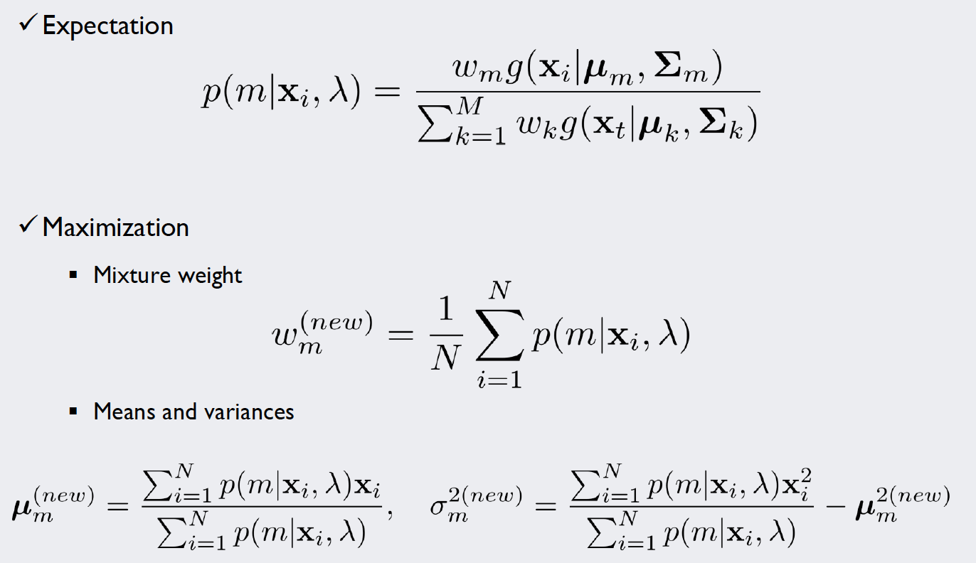
Source: Kang, Pilsung: “Novelty Detection.” Business Analytics. Korea University, Fall 2018. Lecture.
In the E-Step, we calculate “responsibilities”, that is, probability density values that take into consideration the weight of our density functions. To normalize the values, we divide it by the sum over all classes. Now we have specific values for each data point that give an impression how likely it is that our measurement is part of (or “responsible” for) a density function.
In the M-Step, the parameters of the density functions are improved with the new information gained by the E-Step: For multiple Gaussians, a single datapoint might contribute more to curve A rather than curve B. How much “more” it contributes is expressed by the responsibilities. Thus, if we integrate these values into our MLE calculations, we get estimates that account for the importance of each point for the curve.
With these new and improved parameters, we can again calculate responsibilities and repeat the E- and M-Step until we no longer improve significantly.
Source 1: Expectation Maximization with Gaussian Mixture Models: http://aishack.in/tutorials/expectation-maximization-gaussian-mixture-model-mixtures/ Source 2: Gaussian mixture models and the EM algorithm, Ramesh Sridharan, https://people.csail.mit.edu/rameshvs/content/gmm-em.pdf
Initializing the mean vectors
In order to start our iterations, we need a first estimate of the mean and covariance values. Theoretically, these could be chosen randomly. However, for fast convergence and to avoid numerical issues it is sensible to initialize them with the results of a preemptive clustering algorithm, as a heuristic so to speak. For this, we use the KMeans class of the previously imported sklearn.cluster module. The number of clusters we want is equal to our classes hyperparameter. As we only want a rough, fast estimation we set the number of repetitions to n_init=1 and the iterations to max_iter=100. Now, to output the values of our mean vectors we just store the values of kmeans.cluster_centers_.
kmeans = KMeans(n_clusters=classes, n_init=1, max_iter=100)
kmeans.fit(X_train)
mean = kmeans.cluster_centers_
grouping = kmeans.labels_
print(mean.shape)
print(mean)
print(grouping)
The output shows us the dimensions and values of the mean matrix, as well as the labels that the K-Means Algorithm assigned. As expected, we get five vectors with three dimensions each. Note that with every execution of the program we will get a different initial value. This (theoretically) makes our method viable for ensemble learning.
(5, 3)
[[-0.3803923   0.52436245 -0.11531249]
 [ 1.70235562 -1.46803906  1.05820627]
 [ 0.56667427  0.67061325 -1.05217442]
 [-1.15112262 -1.58465221 -0.05766727]
 [ 0.71605563 -1.66919745  2.80810061]]
[0 0 0 0 0 0 0 0 2 2 0 0 2 0 0 0 0 0 0 0 0 0 0 0 0 0 0 2 0 2 2 0 0 0 2 0 0
 0 2 2 2 2 0 0 0 0 0 0 0 2 0 2 2 2 2 2 2 2 2 2 2 2 2 0 0 0 0 0 0 2 0 0 0 0
 0 1 0 0 0 0 0 0 0 0 0 0 0 0 0 0 0 0 0 0 2 2 3 3 3 1 3 3 3 3 0 0 0 0 0 0 0
 0 0 0 0 0 0 0 0 0 1 3 3 2 0 0 0 0 0 0 0 0 0 0 0 0 0 2 0 0 0 0 2 2 0 0 0 0
 2 0 0 0 2 2 4 3 3 3 3 3 3 3 4 4 3 3 3 0 1 0 1 1 1 1 4 1 1 4 4 1 4 1 1 3 1
 1 1 1 1 1 4 4 1 1 1 1]
Initializing the covariance matrices
As the K-Means Algorithm is not directly concerned with parameters like the covariance and relies more heavily on terms like distance, we have to use a small workaround to get our initial values: Using the np.where function, we can divide the training dataset into our clusters. On these clusters, we simply use the maximum likelihood estimator provided by np.cov. If we do this for every class, we get five covariance matrices. However, we have to use a small numerical trick to ensure stability of our EM Algorithm later: All matrices in the iterations have to be positive semi-definite. We decrease the chance of numerical errors leading to an abort by adding a boost to the matrix entries of the main diagonal.
# Calculate covariance matrices for each of these clusters
boost = 0.1
cov = np.zeros([dimensions, dimensions, classes])

for i in range(classes):

    cluster_i = X_train[np.where(grouping == i)]
    cov_i = np.cov(cluster_i.T)
    # Broadcast and boost to minimize numerical errors later
    cov[:,:,i] = cov_i + np.eye(dimensions)*boost

print(cov.shape)
print(cov)
The print function visualizes our matrices a bit counter-intuitively: Logically, we just produced five 3 by 3 matrices. These are found by looking at the five “columns” of the output.
(3, 3, 5)
[[[ 0.27686646  0.39999395  0.41505113  1.749601    0.57213442]
  [ 0.00354934 -0.09172657  0.01145899 -0.07321523  0.03213017]
  [ 0.02217308  0.02855617 -0.02121458 -0.04219396 -0.13934537]]

 [[ 0.00354934 -0.09172657  0.01145899 -0.07321523  0.03213017]
  [ 0.14297414  0.65742805  0.12139052  0.35600771  0.48500441]
  [-0.00595476 -0.05585133 -0.01862252  0.17695803  0.28945166]]

 [[ 0.02217308  0.02855617 -0.02121458 -0.04219396 -0.13934537]
  [-0.00595476 -0.05585133 -0.01862252  0.17695803  0.28945166]
  [ 0.26782428  0.5720762   0.46812352  0.97816012  0.42431184]]]
Initializing the weight vector
The weight vector is what defines the linear combination of the single functions. The sum of its entries must be 1 to yield another viable probability density function.
# Initialize weight vector
weight = []
for i in range(classes):
    weight = np.append(weight,1/classes)
print(weight)
As we do not know (yet) how to combine the functions, it makes sense to initialize the entries equally, so in our case to 1/5th.
[0.2 0.2 0.2 0.2 0.2]
Implementation of the E-step
For an easily readable algorithm later, we implement the actual calculations of our steps into functions.
Source: Kang, Pilsung: “Novelty Detection.” Business Analytics. Korea University, Fall 2018. Lecture.
The code below is doing exactly what the formula states above. The calculations are divided into two steps. The first for-loop calculates the numerators of the equation (here called pvalues for preliminary values) and the second for loop uses these values to normalize them via the sum over all density functions. These responsibility values are stored in the ndarray called rvalues and subsequently returned.
# E-Step
# Arguments: number of classes (M), weights (w), pdfs(mu,sigma)
# Returns: responsibilities

def E_step(M,w,mu,sigma):

    pvalues = np.zeros([instances, classes])
    rvalues = np.zeros([instances, classes])

    for m in range(M):
        pvalues[:,m] = w[m] * multivariate_normal.pdf(X_train, mean=mu[m], cov=sigma[:,:,m])
    for i in range(instances):
        rvalues[i,:] = pvalues[i,:] / np.sum(pvalues[i,:])

    return rvalues
Implementation of the M-step
Once again we want to implement the equations below into a single function, so that we can use them in our EM-Algorithm later. This time, our function will return three objects: The new weight vector, mean vectors and covariance matrices.
Source: Kang, Pilsung: “Novelty Detection.” Business Analytics. Korea University, Fall 2018. Lecture.
As we already calculated the responsibilities in the E-step, we can just pass them as a parameter to the function (here we called it r). This makes the calculation of the new values for the weight vector a simple one-liner.
For the new mean vectors, the multiplication and subsequent summation over all instances in the numerator are implemented simultaneously by using the np.matmul() function: It multiplies the matrix of the responsibilities (transposed, so that the dimensions match) with the input matrix X. Then we normalize the vector of each class by dividing it by the sum of the responsibilities of that class.
# M-Step
# Arguments: number of classes (M), responsibilities (r), x-values (X)
# Returns: w_new, mu_new, cov_new

def M_step(M,r,X):

    ### New weights ###
    w_new = np.sum(r,axis=0) / instances

    #### New mean vector ###
    mu_raw = np.matmul(r.T,X)
    # Normalize
    mu_new = np.empty([M,dimensions])
    for m in range(M):
        mu_new[m] = mu_raw[m] / np.sum(r,axis=0)[m]
Calculating the new covariance matrices is not so trivial: It differs from the usual MLE as it weighs each instance individually. The np.cov() function actually provides this feature (but only in more recent versions, so the installation has to be checked). By setting the aweights parameter equal to the responsibilities and making sure that we use the correct bias with ddof=0 we can calculate the new matrices for each class.
However, to clarify how to implement the equation from above, there is an alternative implemented beneath; its values are stored in cov_new_b. Both ways were tested on multiple occasions and produced the same results.
    ### New covariance (Method a (np) or b (low-level)) ###
    cov_new_a = np.zeros([dimensions, dimensions, classes])
    for m in range(classes):
        cov_new_a[:,:,m] = np.cov(X.T, ddof=0, aweights = r[:,m])

    cov_new_b = np.zeros([dimensions, dimensions, classes])
    for m in range(classes):
        cov_vect = np.zeros([dimensions, dimensions])
        for i in range(instances):
            cov_vect = cov_vect + r[i,m] * np.outer((X[i]-mu_new[m,:]),
                                                    (X[i]-mu_new[m,:]).T)
        cov_new_b[:,:,m] = cov_vect / np.sum(r,axis=0)[m]

    return   w_new, mu_new, cov_new_a, cov_new_b
Implementing the algorithm
The algorithm itself is very straightforward: We just plug the results of one step into the other and repeat this until we converge. Step one is explicitly defined so that we can initialize our variables correctly:
# EM-Algorithm
iterations = 50

# E-Step 1
results = E_step(classes,weight,mean,cov)
#print(results)

# M-Step 1
w_new, mu_new, cov_new_a, cov_new_b = M_step(classes,results,X_train)

# Iterations:

# Store the progression of a weight for example:
w_new_collection = np.empty([iterations])

for i in range(iterations):
    results = E_step(classes,w_new, mu_new, cov_new_b)
    w_new, mu_new, cov_new_a, cov_new_b = M_step(classes,results,X_train)
    w_new_collection[i] = w_new[3]

print(mu_new)
print(cov_new_a)
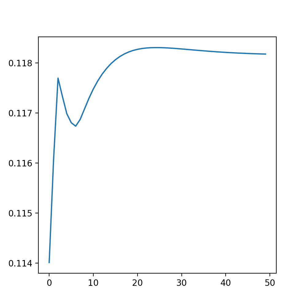
There are multiple ways to ensure that the algorithm converges and does not change significantly anymore. While methods such as the log-likelihood may be very precise, it is also possible to do it graphically: In w_new_collection we stored the value of the fourth entry of the weight vector for every iteration (w.l.o.g., every other entry would have done). Looking at the picture below, we see that after around 40-50 iterations the changes become quite insignificant:
Applying the cutoff
The calculation of the density function values happens similarly to the Unigaussian method by using the multivariate_normal.pdf() function, parametrized with the values that our last EM iteration yielded. In an additional step, we combine the values of each class with a weighted sum; the weights of course being the entries of the weight vector of the last iteration.
cutoff = 0.05
densities = np.zeros([test_instances,classes])
pdfvalues = np.zeros([test_instances])

for m in range(classes):
    densities[:,m] = multivariate_normal.pdf(X_test, mean=mu_new[m], cov=cov_new_a[:,:,m])

# Combining the PDFunctions by multiplying with according weights
pdfvalues = np.matmul(densities,w_new)

# Results
for i in range(test_instances):
    if pdfvalues[i] < cutoff:
        print("Instance ", i, ": Outlier")
    else:
        print("Instance ", i, ": Normal")
The output proves that the additional work paid off: Only one instance (0) of the test set got misidentified; as it is a sample of the target class it represents a false negative.
Instance  0 : Outlier
Instance  1 : Normal
Instance  2 : Normal
Instance  3 : Normal
Instance  4 : Normal
Instance  5 : Normal
Instance  6 : Normal
Instance  7 : Normal
Instance  8 : Normal
Instance  9 : Outlier
Instance  10 : Outlier
Instance  11 : Outlier
Instance  12 : Outlier
Instance  13 : Outlier
Instance  14 : Outlier
Instance  15 : Outlier
Instance  16 : Outlier
Instance  17 : Outlier
This result represents an F1-score of 0.94, which is an improvement over the Unigaussian method’s 0.89.
Kernel Density Estimation
The Kernel Density Estimation (also called Parzen Window Density Estimation) takes our approach of stripping assumptions from the model even farther: We do not assume an underlying density function (or multiple) at all. This approach is called non-parametric. That is, we do not calculate parameters of assumed underlying density functions, but instead base the density on the points themselves. Every point will be represented by a symmetric “window” or “kernel” function. In the end, all points are combined and the values are normalized. The picture below illustrates the process:
Source: Kang, Pilsung: “Novelty Detection.” Business Analytics. Korea University, Fall 2018. Lecture.
The implementation
The imports do not differ too much from the former ones, except for the math module, which is needed for the kernel functions. Not assuming an underlying distribution, we can get rid of the scipy.stats module.
# For Kernel Calculations
import math
# For plotting
import matplotlib.pyplot as plt
import pandas as pd
import seaborn as sns
# For matrix math
import numpy as np
# Plot style
%matplotlib notebook
# Set plot size in notebook
plt.rcParams["figure.figsize"] = (5, 5)
The dataset
The original dataset is the same as before. We - again - take two arbitrary columns (more dimensions could be used, however this allows us to see a visual representation of the process later). The same StandardScaler class is used to ensure proper function of the algorithm.
# dataset
glass = pd.read_csv("../2.Data/Glass_Data.csv")
npdata = glass.values
# Separate input data from labels
npinput = np.append(npdata[:,1:2],npdata[:,4:5],axis=1)
nplabels = np.delete(npdata,np.s_[:9],1)

# Separate training data (clean)
X_train = np.append(npinput[9:176],npinput[185:], axis=0)
Y_train = np.append(nplabels[9:176],nplabels[185:])
# Rest: Test data (polluted)
X_test = np.append(npinput[:9],npinput[176:185], axis=0)
Y_test = np.append(nplabels[:9],nplabels[176:185])

print(X_train.shape)
print(X_test.shape)

# Scale the dataset
from sklearn.preprocessing import StandardScaler
scaler = StandardScaler()
scaler.fit(X_train)

X_train = scaler.transform(X_train)
X_test = scaler.transform(X_test)
(196, 2)
(18, 2)
The process
To understand what a possible kernel density estimation would look like and how it can help separate our dataset, we can look at the plot below. The blue points represent the training dataset that we just generated. Based on these we want to calculate the KDE. The green points are the target samples of the test data (we want to identify them as “normal”), the orange ones are the novelty samples (class 6, like before).
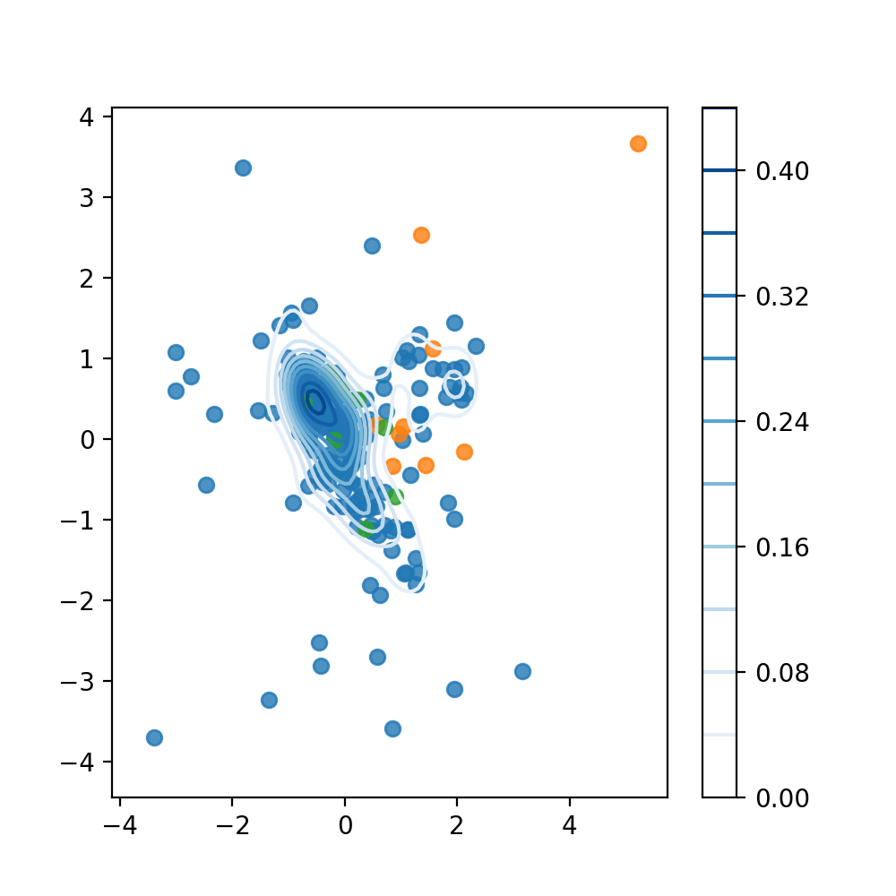
Source: Kang, Pilsung: “Novelty Detection.” Business Analytics. Korea University, Fall 2018. Lecture.
These scatterplots are combined with an automatically generated contour plot of a kernel density estimate. The seaborn module implements this ability in its kdeplot()
function. If we now use a certain value of the function as cutoff, e.g. 0.16, we would identify everything outside of this contour as an outlier. The shape of the contours themselves can be altered with the hyperparameter h (the relevant argument in the function is called bw). Generally speaking, the smaller the value, the more the function tends to overfit the data.
# Visualize Process

# Training Data
sns.regplot(X_train[:,0],X_train[:,1], fit_reg=False)
# Test Data (Novelty)
sns.regplot(X_test[9:,0],X_test[9:,1], fit_reg=False)
# Test Data (Target Samples)
sns.regplot(X_test[:9,0],X_test[:9,1], fit_reg=False)
# KDE plot
sns.kdeplot(X_train[:,0],X_train[:,1], cmap='Blues',
            cbar=True, bw=0.25)

plt.show()
The kernel functions
But how does seaborn calculate the values of the kernel density estimate? To answer this question, we need to look at the kernel functions themselves. The idea of a kernel function is to return a scalar value for every point that is plugged into it. This scalar indicates whether the point is close to another fixed point or not.
If a point is in a high density region, it will be close to a lot of different fixed points and thus return high overall values for a lot of their respective kernel functions. If these values are subsequently combined and normalized, it will have a high score and is likely to be identified as target data.
Two examples of possible kernel functions are shown below:
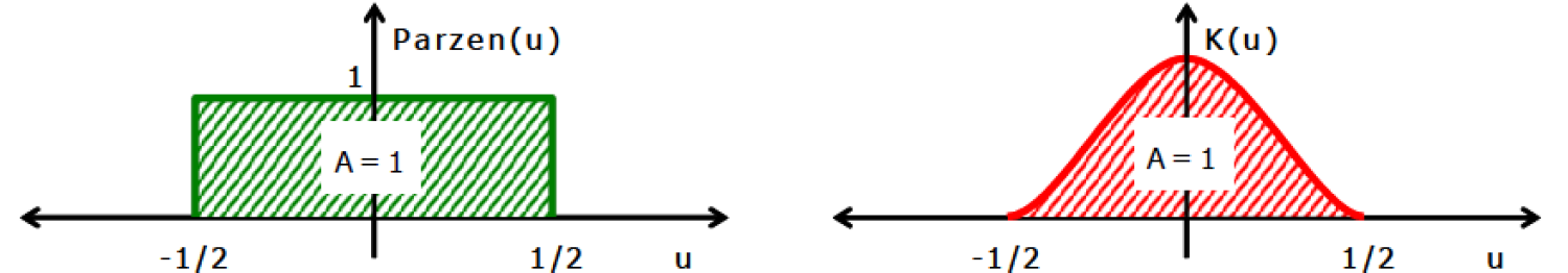
Source: Kang, Pilsung: “Novelty Detection.” Business Analytics. Korea University, Fall 2018. Lecture.
The first kernel is called the “Parzen Window” or simply a uniform kernel. Its basic idea is that when a point lies within a distance window, the value 1 is returned, otherwise the value 0. If we want to account for how far our point is from the fixed point represented by the center of the distribution, we can use continuous examples like the Gaussian Kernel. The equations to calculate the function values are implemented in the Kernel() function below. Other common kernels can be found here.
# Define Kernel functions
def Kernel(x,y,h,ktype):
    if ktype == 'Gauss':
        c = 1 / math.sqrt(2*math.pi)
        return c * math.exp(-0.5 * (np.linalg.norm(x-y)/h)**2)

    if ktype == 'Uniform':
        indicator = 0
        if ((np.linalg.norm(x-y))/h < 0.5):
            indicator = 1
        return indicator

    else:
        print("Please select a valid kernel type: Gauss / Uniform.")
        return None
Calculating the kernel density estimation
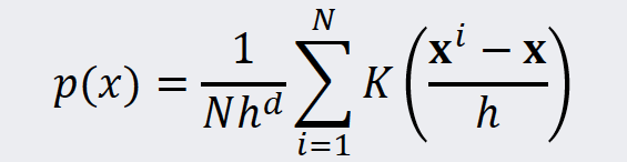
In the next step we combine the individual values of the kernel functions into a density estimate. That is, we summarize the kernel functions and subsequently normalize the sum with the number of instances and the volume enclosed by the window of the kernel. The equation for this task is shown below:
Source: Kang, Pilsung: “Novelty Detection.” Business Analytics. Korea University, Fall 2018. Lecture.
In our code we can use the Kernel() function that we already implemented above. The argument ktype lets us choose between the Uniform or Gaussian kernel.
def KDE(x,x_i,h,ktype):
    density = 0
    for n in range(x_i.shape[0]):
        density = density + (1/(x_i.shape[0]*(h**x_i.shape[1]))) * Kernel(x,x_i[n],h,ktype)
    return density
Calculating the density values
Now we can use a simple for-loop to calculate the values for every point of the test dataset. It is possible to optimize the hyperparameter h, for example by the EM Algorithm. However, for our example empirical testing yielded a sufficient precision. The cutoff and kernel variables can be changed as well to analyze their effect on the performance on the algorithm.
# Define hyperparameter
h = 0.35
# Calculate pdf-values for Test Set and apply cutoff:
cutoff = 0.15
kernel = 'Gauss' # 'Gauss'/'Uniform'

for i in range(X_test.shape[0]):
    result = KDE(X_test[i],X_train,h,kernel)
    print("Instanz ", i, ":",result)
The console output for the parametrization above looks as follows:
Instanz  0 : 0.2544361485643299
Instanz  1 : 0.170102912151327
Instanz  2 : 0.3685714976769387
Instanz  3 : 0.6915412935436304
Instanz  4 : 0.5394803527213847
Instanz  5 : 0.6996028703553688
Instanz  6 : 0.49972543534560154
Instanz  7 : 0.46078286723816414
Instanz  8 : 0.15448737461087167
Instanz  9 : 0.1218002117853651
Instanz  10 : 0.23361636527120835
Instanz  11 : 0.04480047834995767
Instanz  12 : 0.10069013866061868
Instanz  13 : 0.000726939999060868
Instanz  14 : 0.017550560778012394
Instanz  15 : 0.09764727245737599
Instanz  16 : 0.10728687831814344
Instanz  17 : 1.9280271379631542e-28
Assessing the results
Once again we can generate a confusion matrix from the results above. The code is virtually the same as above, and thus needs no further explanation.
# Generate confusion matrix:
tp = 0
fn = 0
tn = 0
fp = 0
results = np.empty((X_test.shape[0],1),dtype='object')

for i in range(X_test.shape[0]):
    pdfvalue = KDE(X_test[i],X_train,h,kernel)

    if i < X_test.shape[0]/2 and pdfvalue >= cutoff:
        tp = tp + 1
        results[i] = "True Positive"
    if i < X_test.shape[0]/2 and pdfvalue < cutoff:
        fn = fn + 1
        results[i] = "False Negative"
    if i >= X_test.shape[0]/2 and pdfvalue < cutoff:
        tn = tn + 1
        results[i] = "True Negative"
    if i >= X_test.shape[0]/2 and pdfvalue >= cutoff:
        fp = fp + 1
        results[i] = "False Positive"

print("Confusion Matrix:\n",tp,fp,"\n",fn,tn)
The confusion matrix generated can be seen below:
Confusion Matrix:
 9 1
 0 8
This matrix represents an F1-Score of about 0.95, which is marginally better than the MoG’s 0.94 and a substantial improvement over the Unigassian’s 0.89.
Local Outlier Factor (LOF)
The LOF method is a distance-based novelty detection algorithm. It is based on the idea, that the “density” of a point can be calculated as a function of the distance to its nearest neighbors and the number of neighbors that this point has. In a final step it compares the points density to the densities of its local group and thus calculates the eponymous “local outlier factor”. The illustration below shows the assignment of a specific score to each sample point.
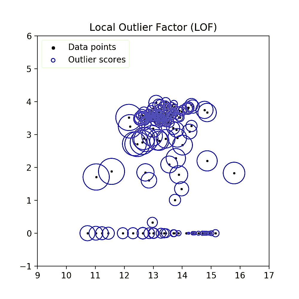
Qualitatively speaking, one can already see that instances in low density regions have a bigger radius circle (and thus score) assigned to them. For the calculation of the LOF, the method introduces a number of new definitions and magnitudes, all of which will be explained step by step in this chapter.
The imports
In this algorithm we will not use statistical methods and thus the number of required imported modules is reduced.
# For plotting
import matplotlib.pyplot as plt
import pandas as pd
import seaborn as sns
# For matrix math
import numpy as np
# Plot style
%matplotlib notebook
# Set plot size in notebook
plt.rcParams["figure.figsize"] = (5, 5)
A new dataset
For this chapter, we introduce a new dataset. It is based on the Wisconsin Breast Cancer dataset, provided by the UCI machine learning repository. It is divided into two classes, the benign instances (labeled “2”) and the malignant (labeled “4”). The number of the latter instances has been reduced to build a novelty class. This leaves us with 479 instances in total, spanning 10 Dimensions.
# Import a Dataset used for Novelty Detection
wbc = pd.read_csv("../2.Data/WBC_Minority.csv")
wbc.head(n=5)
Source: University of Wisconsin Hospitals, Madison from Dr. William H. Wolberg, O. L. Mangasarian and W. H. Wolberg: “Cancer diagnosis via linear programming”, SIAM News, Volume 23, Number 5, September 1990, pp 1 & 18. UCI Machine Learning Repository [http://archive.ics.uci.edu/ml]. Irvine, CA: University of California, School of Information and Computer Science.
Separating the dataset
The data is separated into a clean dataset spanning 400 benign instances and a polluted test dataset consisting of the first 79 samples. Unfortunately, the “bare nuclei” column has to be removed due to incomplete data.
# Create input data ndarray

# Remove bare nuclei column due to incomplete data
# Slice into test and training data
X = np.append(wbc.values[:,1:6],wbc.values[:,7:10], axis=1)
X_test = X[:79,:] # Polluted
X = np.delete(X,np.s_[:79],0)
# Slice labels into test and training data
y = wbc.values[:,10]
y_test = y[:79] # Polluted
y = np.delete(y,np.s_[:79])
print(X.shape)
print(X_test.shape)
print(y.shape)
print(y_test.shape)
print(X[:5,:])
This leaves us with 8 dimensions for the input as we can see below. The first goal is now to train the LOF algorithm on our training dataset, that is, to calculate the LOF for every of the 400 instances.
(400, 8)
(79, 8)
(400,)
(79,)
[[1 3 1 2 2 5 3 2]
 [3 3 2 1 2 3 1 1]
 [1 1 1 1 2 1 1 1]
 [8 3 3 1 2 3 2 1]
 [1 1 1 1 4 1 1 1]]
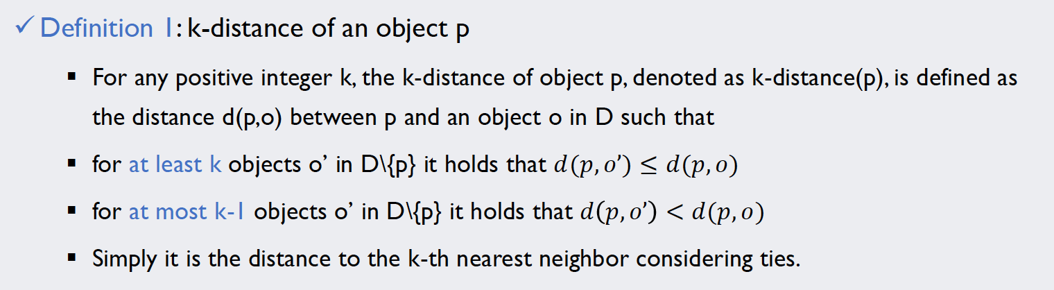
The k-distance
The first thing we need to know on our way to calculating the LOF of our instances is the k-distance of every point. Its definition can be found below:
Source: Kang, Pilsung: “Novelty Detection.” Business Analytics. Korea University, Fall 2018. Lecture.
But in order to be able to compare the distances for each point, we first need to calculate a complete distance matrix. The np.linalg.norm() function can calculate the scalar norm of vectors (i.e. the magnitudes) in any number of dimensions. Applying this function to the difference vectors of each pair of distances will give us a 400 by 400 matrix containing the distances.
# Calculate distance matrix
instances = X.shape[0]
distance = np.zeros([instances, instances])
print(distance.shape)

for i in range(instances):
    for j in range(instances):
        distance[i,j] = np.linalg.norm(X[i,:] - X[j,:])

print(distance[10:15,10:15])
An excerpt of the matrix can be found in the console output below:
(400, 400)
[[0.         9.21954446 8.30662386 8.36660027 7.34846923]
 [9.21954446 0.         3.74165739 3.         3.        ]
 [8.30662386 3.74165739 0.         1.73205081 1.73205081]
 [8.36660027 3.         1.73205081 0.         1.41421356]
 [7.34846923 3.         1.73205081 1.41421356 0.        ]]
With this data, we can now simply use the definition of the k-distance to obtain it. The np.sort() function makes this task very easy. As its default sorts in ascending order, we can simply define which k should be used and pick out the [k - 1]-th object (mind the Python indexing).
# Calculate k-distance for each point (distance to k-th nearest neighbor)
k = 50
k_dist = np.zeros([instances])

for i in range(instances):
    k_dist[i] = np.sort(distance[i,:])[k - 1]

print(np.sort(distance[0,:]).shape)
print(k_dist[10:15])
This yields a 400-entry column vector containing the 50-distance for each point. Note that k is essentially a hyperparameter in this algorithm, as there is no clear guidance how to choose it other than its effect on the algorithms performance.
(400,)
[8.         2.23606798 1.41421356 1.41421356 1.41421356]
The k-distance neighborhoods
The next step is to find the k-distance neighborhoods for each point. The definition of this term is very intuitive: A point belongs to the k-distance neighborhood of a different instance if and only if its distance is smaller or equal to the k-distance:
![]()
Source: Kang, Pilsung: “Novelty Detection.” Business Analytics. Korea University, Fall 2018. Lecture.
In the code it is implemented via a 400 by 400 matrix, initialized with zeros. If N_k[i,j] is equal to one, it means that point j is in the neighborhood of point i. The numerical values were chosen over boolean ones because the will greatly facilitate calculations afterwards.
# Assign k-distance neighborhoods

N_k = np.zeros([instances, instances])

for i in range(instances):
    for j in range(instances):
        if distance[i,j] <= k_dist[i]:
            N_k[i,j] = 1

# A point is not the neighbor of itself:
neighbors = N_k - np.eye(instances)

print(np.eye(instances))
print(neighbors.shape)
print(neighbors[10:15,10:15])
Note that in the definition, a point is defined not to be the neighbor of itself! Thus, we subtract the identity matrix np.eye() from our result, essentially nullifying the main diagonal. The final matrix does not have to be symmetrical due to different local densities around the individual points. A far-away point may consider some points of nearby clusters as its neighbors, however these points are unlikely to view him as one.
[[1. 0. 0. ... 0. 0. 0.]
 [0. 1. 0. ... 0. 0. 0.]
 [0. 0. 1. ... 0. 0. 0.]
 ...
 [0. 0. 0. ... 1. 0. 0.]
 [0. 0. 0. ... 0. 1. 0.]
 [0. 0. 0. ... 0. 0. 1.]]
(400, 400)
[[0. 0. 0. 0. 1.]
 [0. 0. 0. 0. 0.]
 [0. 0. 0. 0. 0.]
 [0. 0. 0. 0. 1.]
 [0. 0. 0. 1. 0.]]
The reachability distance
The actual “distance” measure that we will use to calculate the densities around each point is called “reachability distance”. Its definition and an example explaining the concept can be found below:
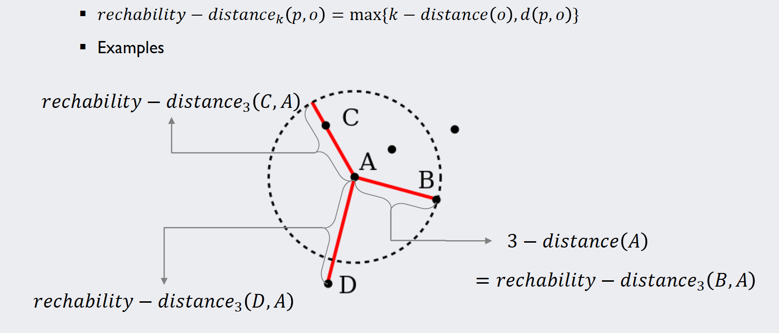
Source: Kang, Pilsung: “Novelty Detection.” Business Analytics. Korea University, Fall 2018. Lecture.
This measure is introduced to have a lower boundary for the distances in order to keep the algorithm numerically stable when dividing by them. Note that like the neighborhood matrix, this “distance” measure is non-symmetrical and thus does not technically fulfill the mathematical criterion to be called a “distance”.
The code below simply implements the definition. The variable r_dist is initialized as a copy of our distance matrix. Values that are smaller than the k-distance for the respective points are replaced.
# Calculate reachability distance for each point from each point
# Motivation for this definition is numeric stability

# Copy distance matrix
r_dist = distance

# Replace relevant entries for reachability-distance
for i in range(instances):
    for j in range(instances):
        if i != j and r_dist[i,j] < k_dist[i]:
            r_dist[i,j] = k_dist[i]

# Look at results
print(r_dist[10:15,10:15])
The print-function gives us an excerpt of our reachability distance matrix:
[[0.         9.21954446 8.30662386 8.36660027 8.        ]
 [9.21954446 0.         3.74165739 3.         3.        ]
 [8.30662386 3.74165739 0.         1.73205081 1.73205081]
 [8.36660027 3.         1.73205081 0.         1.41421356]
 [7.34846923 3.         1.73205081 1.41421356 0.        ]]
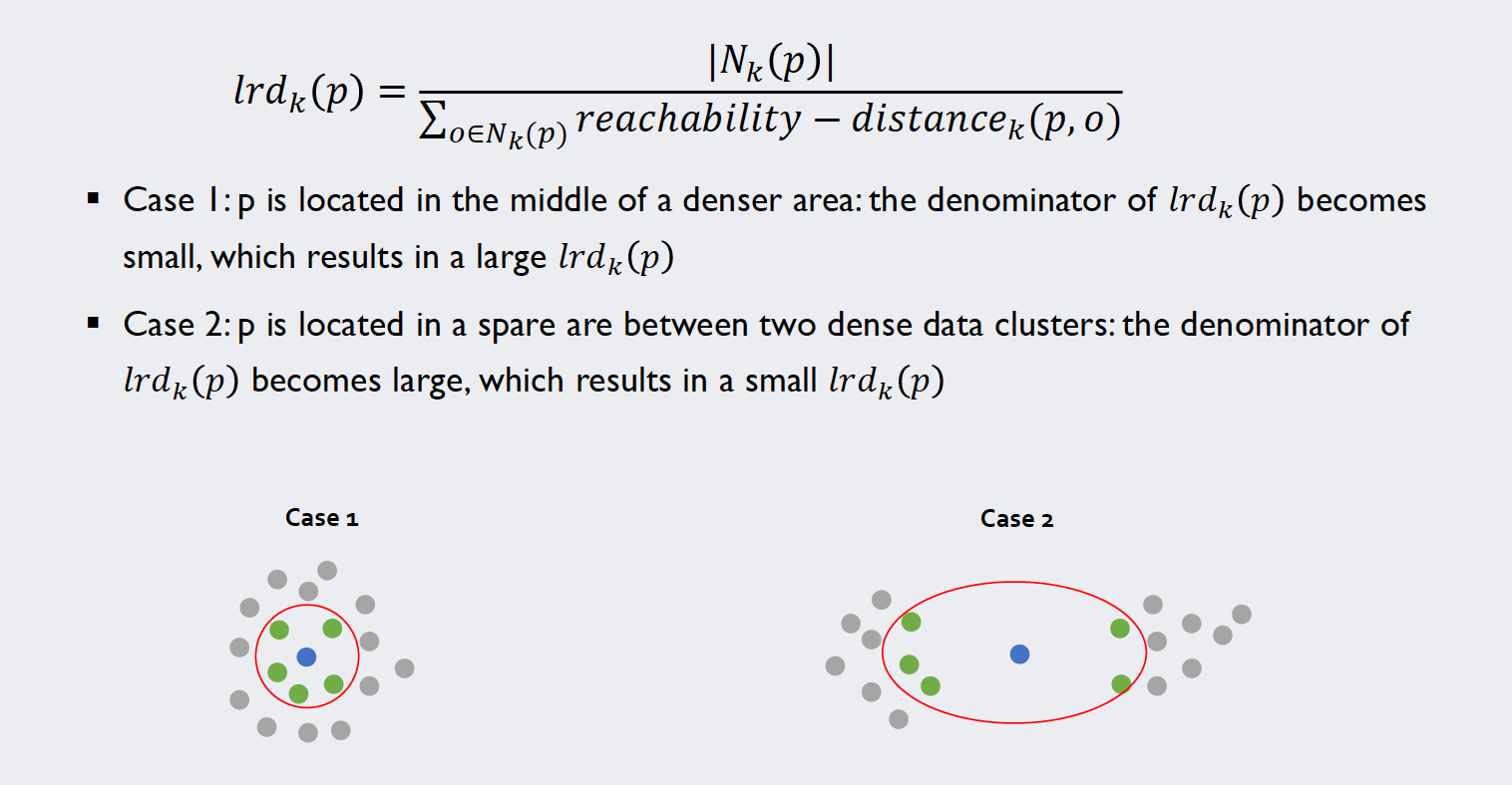
The local reachability density
In our penultimate step to calculate the local outlier factors we look at the local reachability distance of our target samples. A definition alongside this example should clarify how we can calculate these values for each point:
Source: Kang, Pilsung: “Novelty Detection.” Business Analytics. Korea University, Fall 2018. Lecture.
The fact that we implemented the information about the neighbors numerically is beneficial now: For the sum indexed over the neighbors of each point we can simply use the dot product of the reachability distance and the respective vector in the neighbor matrix.
# Calculate local reachability density
lrd = np.zeros(instances)

for i in range(instances):
    lrd[i] = np.sum(neighbors[i,:]) / np.dot(r_dist[i,:],neighbors[i,:])

print(lrd[10:15])

### Check for zero entries ###
for i in range(instances):
    if np.dot(r_dist[i,:],neighbors[i,:]) == 0:
        print(np.dot(r_dist[i,:],neighbors[i,:]))
The last code bit checks for zero entries in our local reachability density vector. Although that is attempted to be prevented by choosing a large enough k and defining the reachability distance, depending on the dataset, one can still run into numerical problems. Luckily with this parametrization, we don’t. Thus, the output only gives us the newly calculated values for lrd:
[0.125 0.4472136 0.70710678 0.70710678 0.70710678]
The local outlier factors
With these values at hand, we can calculate the local outlier factors by relating the density of a point to the one of its neighbors. The image below illustrates the calculation and most importantly the meaning of this value:
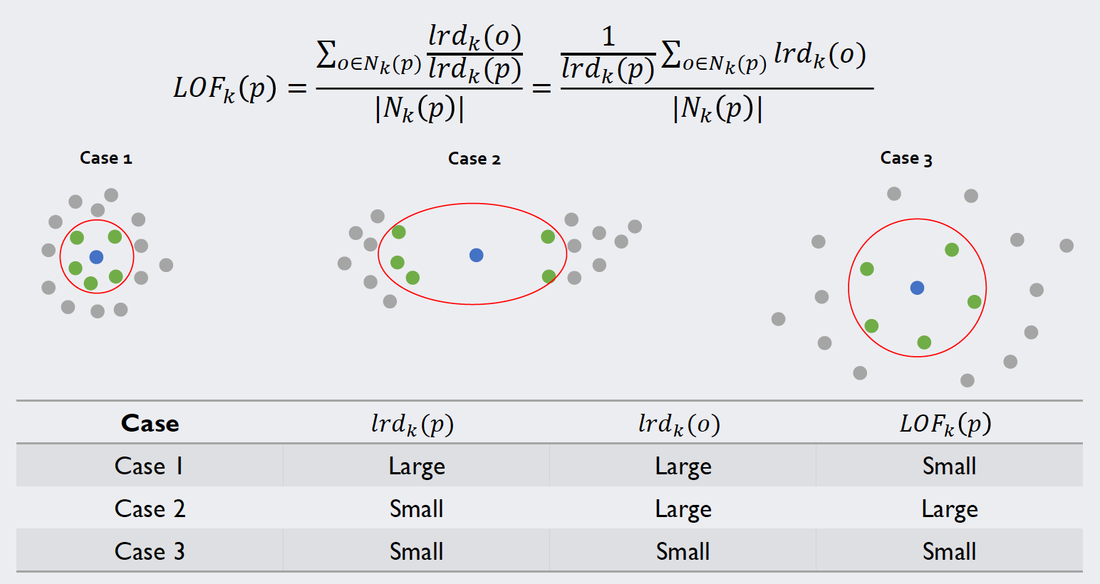
Source: Kang, Pilsung: “Novelty Detection.” Business Analytics. Korea University, Fall 2018. Lecture.
Again, we tackle the indexed sum with the np.dot() function; apart from that, the calculation is analogous to the equation above.
# Calculate LOFs
lof = np.zeros(instances)

for i in range(instances):
    lof[i] = (np.dot(lrd,neighbors[i,:])/(np.sum(neighbors[i,:]))) / lrd[i]

print(lof[10:15])
print(lof.shape)
This console output shows that we successfully calculated the local outlier factors for every instance of the training set.
[6.46138677 1.47171121 1.27182765 1.23842551 1.2787892 ]
(400,)
Novelty detection with LOF
We now can to use these values to identify novelty data in our test set, which was our original intention from the beginning. For this, we write a function that can be fed a test instance (called new_point) and will return the LOF of that specific point. Note that now we only compare the new point to the training samples, not to the rest of the test samples. We do not want our test data to pollute our decision boundary.
# We now have LOF Data for every training instance
# Use it to classify test samples

def LOF(new_point):
    # Calculate distance to every other point
    position = np.empty(instances)
    for i in range(instances):
        position[i] = np.linalg.norm(new_point-X[i,:])

    # Calculate k-distance
    k_dist_new = np.sort(position)[k - 1]

    # Define Neighborhood
    N_new = np.zeros(instances)
    for i in range(instances):
        if position[i] <= k_dist_new:
                N_new[i] = 1

    # Define reachability distance
    r_new = position
    for i in range(instances):
        if r_new[i] < k_dist_new:
            r_new[i] = k_dist_new

    # With this calculate lrd(new_point)
    lrd_new = np.sum(N_new)/np.dot(r_new,N_new)

    # Use known np.dot(lof(test), Neighborhood) to calculate lof(new_point)
    lof_new = (np.dot(N_new,lrd) / lrd_new) / np.sum(N_new)
    return(lof_new)
We can use this function to calculate the LOF for every single point of our test dataset and store it in the ndarray called lof_values.
# Calculate LOF values for test set
lof_values = np.empty(X_test.shape[0])
for t in range(X_test.shape[0]):
    lof_values[t] = LOF(X_test[t])
Assessing the results
Akin to other density-based approaches, we will discriminate based on a cutoff value. Note however, that in this case a higher value indicates a higher probability of an outlier. The cutoff value itself is not clearly defined in the algorithm: A value of one or smaller is always viewed as target data, as it lies in a cluster. Anything above one depends on the dataset itself: Sometimes a 10% increase in the outlier factor means a novelty sample, while in other dataset a score of 2.0 is viewed as absolutely normal.
# Assess results
cutoff = 2.25

# Generate confusion matrix:
tp = 0
fn = 0
tn = 0
fp = 0
results = np.empty((X_test.shape[0],1),dtype='object')

for i in range(X_test.shape[0]):
    pdfvalue = lof_values[i]

    if np.isin(i,np.where(y_test==2)) and pdfvalue < cutoff:
        tp = tp + 1
        results[i] = "True Positive"
    if np.isin(i,np.where(y_test==2)) and pdfvalue >= cutoff:
        fn = fn + 1
        results[i] = "False Negative"
    if np.isin(i,np.where(y_test==4)) and pdfvalue >= cutoff:
        tn = tn + 1
        results[i] = "True Negative"
    if np.isin(i,np.where(y_test==4)) and pdfvalue < cutoff:
        fp = fp + 1
        results[i] = "False Positive"

print("Confusion Matrix:\n",tp,fp,"\n",fn,tn)
In our dataset, the cutoff value of 2.25 produced the best results. The respective confusion matrix can be found below. Note: Because the novelty samples were sprinkled randomly into the test data on this occasion, a combination of the np.isin() and the np.where() function was used to extract the correct labels.
Confusion Matrix:
 50 2
 8 19
We use the formula for the F1-Score again to get an impression of how well the algorithm performed.
# F1 Score
f1 = (2*tp)/(2*tp+fp+fn)
print(f1)
With an F1-Score of about 0.91 we see that this simple code can differentiate novelty data from target samples reasonably well.
The reader is encouraged to calculate different performance metrics for each algorithm, as well as different datasets and hyperparameters.
All written code and all other files can be found in my Machine Learning repository.
For questions or feedback click one of the buttons below.